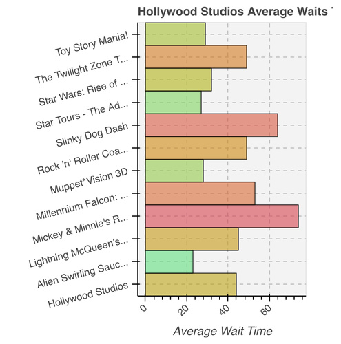
Exclusive to park pages is a bar graph summary of the average wait time of each attraction and the average of the park itself. Green means waits are shorter; red longer. This graph will appear after 10 AM on park operating days.
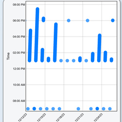
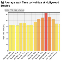
On both park and attraction pages, you can find scatter and bar graphs of the park or attraction’s daily average, weekly average, and monthly average wait time. Select the tab above the graph to change the graph type. Some graphs will look better on a computer screen versus a mobile device. A trend line is provided to give clarity to how wait times are changing over time.
We hope you enjoy these new graphs that provide further insight into theme park wait times!


Great
But, could I have an app on my phone that -
Would use GPS to automatically log time the wait times?