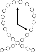
Park Flow Map at SeaWorld San Antonio
Generating Graph!
This graph shows how wait times change around SeaWorld San Antonio over the course of the day.
Bigger circles indicate larger wait times.
Click the play button to animate the map. Use fingers or a mouse to zoom in or out on the map.

